CSS로 라이언 캐릭터 만들기 🦁
📌 개요
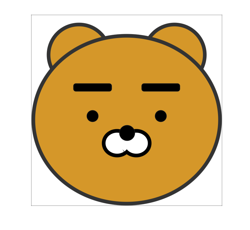
HTML과 CSS만으로 라이언 캐릭터를 그리는 예제입니다. position 속성과 border-radius를 활용하여 각 부위를 배치하고 원형으로 만듭니다.
📁 파일 구조
프로젝트/
├── index.html
└── css/
    └── ryan.css
📄 전체 코드
HTML (index.html)
<!DOCTYPE html>
<html lang="en">
<head>
    <meta charset="UTF-8">
    <meta name="viewport" content="width=device-width, initial-scale=1.0">
    <title>라이언 캐릭터</title>
    <link rel="stylesheet" href="css/ryan.css">
</head>
<body>
    <div class="bigbox">
        <div class="ear left"></div>
        <div class="ear right"></div>
        <div class="face">
            <div class="eyebrow left"></div>
            <div class="eyebrow right"></div>
            <div class="eyeball left"></div>
            <div class="eyeball right"></div>
            <div class="nose"></div>
            <div class="mouth left">
                <div class="mouth_cover left"></div>
            </div>
            <div class="mouth right">
                <div class="mouth_cover right"></div>
            </div>
        </div>
    </div>
</body>
</html>
CSS (css/ryan.css)
* {
    margin: 0;
    padding: 0;
}

/* 부모 컨테이너 */
.bigbox {
    position: absolute;
    width: 500px;
    height: 500px;
    border: 1px dotted #000;
    left: 50%;
    top: 50%;
    transform: translate(-50%, -50%);
    /* 정중앙 박스 */
}

/* 얼굴 */
.face {
    width: 500px;
    height: 450px;
    position: absolute;
    bottom: 0;
    background-color: #d59729;
    border-radius: 50%;
    border: 10px solid #333;
    box-sizing: border-box;
}

/* 귀 */
.ear {
    width: 150px;
    height: 150px;
    position: absolute;
    background-color: #d59729;
    border-radius: 50%;
    border: 10px solid #333;
    top: 20px;
}

.ear.left {
    left: 40px;
}

.ear.right {
    right: 40px;
}

/* 눈썹 */
.eyebrow {
    width: 100px;
    height: 20px;
    border: 1px solid #333;
    position: absolute;
    top: 120px;
    background-color: #000;
    border-radius: 7px;
}

.eyebrow.left {
    left: 100px;
}

.eyebrow.right {
    right: 100px;
}

/* 눈 */
.eyeball {
    width: 30px;
    height: 30px;
    border: 1px solid #333;
    position: absolute;
    top: 190px;
    background-color: #000;
    border-radius: 50%;
}

.eyeball.left {
    left: 135px;
}

.eyeball.right {
    right: 135px;
}

/* 코 */
.nose {
    width: 40px;
    height: 40px;
    border: 1px solid #333;
    position: absolute;
    bottom: 160px;
    left: 50%;
    margin-left: -20px;
    /* 정중앙 정렬을 할 땐 반지름 값만큼 이동시킴 */
    background-color: #000;
    border-radius: 50%;
    z-index: 1;
}

/* 입 */
.mouth {
    width: 80px;
    height: 74px;
    border: 10px solid #000;
    position: absolute;
    top: 240px;
    background-color: #fff;
    border-radius: 50%;
    box-sizing: border-box;
}

.mouth.left {
    left: 175px;
}

.mouth.right {
    right: 175px;
}

.mouth_cover {
    position: absolute;
    width: 37px;
    height: 40px;
    background-color: white;
    top: 2px;
    transform: rotate(45deg);
}

.mouth_cover.left {
    left: 42px;
}

.mouth_cover.right {
    right: 42px;
}
🏗️ 구조 설명
요소 계층 구조
.bigbox (부모 컨테이너)
├── .ear.left (왼쪽 귀)
├── .ear.right (오른쪽 귀)
└── .face (얼굴)
    ├── .eyebrow.left (왼쪽 눈썹)
    ├── .eyebrow.right (오른쪽 눈썹)
    ├── .eyeball.left (왼쪽 눈)
    ├── .eyeball.right (오른쪽 눈)
    ├── .nose (코)
    ├── .mouth.left (왼쪽 입)
    │   └── .mouth_cover.left
    └── .mouth.right (오른쪽 입)
        └── .mouth_cover.right
요소 배치 순서 (z-index 포함)
| 요소 | 위치 | 크기 | z-index |
|---|---|---|---|
| 귀 (left, right) | 상단 좌우 | 150px × 150px | - |
| 얼굴 (.face) | 하단 | 500px × 450px | - |
| 눈썹 (left, right) | 얼굴 상단 좌우 | 100px × 20px | - |
| 눈 (left, right) | 눈썹 아래 좌우 | 30px × 30px | - |
| 코 | 얼굴 중앙 하단 | 40px × 40px | 1 |
| 입 (left, right) | 코 아래 좌우 | 80px × 74px | - |
| 입 커버 | 입 위 (45도 회전) | 37px × 40px | - |
🎨 주요 CSS 기법
1. 정중앙 정렬 (부모 컨테이너)
.bigbox {
    position: absolute;
    left: 50%;
    top: 50%;
    transform: translate(-50%, -50%);
}
설명:
left: 50%,top: 50%: 요소의 왼쪽 상단 모서리를 화면 중앙에 위치transform: translate(-50%, -50%): 요소 자체 크기의 50%만큼 왼쪽, 위로 이동하여 완전한 중앙 정렬
시각화:
┌─────────────────────────┐
│                         │
│         (50%, 50%)      │ ← left: 50%, top: 50%
│            ┌────┐       │
│            │    │       │
│            └────┘       │
│                         │
└─────────────────────────┘

┌─────────────────────────┐
│                         │
│       ┌─────────┐       │ ← transform: translate(-50%, -50%)
│       │         │       │   적용 후 완전 중앙 정렬
│       └─────────┘       │
│                         │
└─────────────────────────┘
2. 원형 만들기 (border-radius)
.face {
    border-radius: 50%;  /* 완전한 원 */
}
설명:
border-radius: 50%: 너비와 높이의 50%를 반지름으로 하는 원형- 정사각형 요소에 적용하면 완전한 원이 됨
3. position: absolute 활용
부모 요소 기준 배치
.face {
    position: absolute;
    bottom: 0;  /* 부모의 하단에 붙임 */
}
.ear {
position: absolute;
top: 20px; /* 부모의 상단에서 20px 떨어진 위치 */
}설명:
.bigbox가position: absolute이므로 자식 요소들은.bigbox를 기준으로 배치top,bottom,left,right로 정확한 위치 지정
4. 좌우 대칭 배치
방법 1: left와 right 속성 사용
.ear.left {
    left: 40px;  /* 왼쪽에서 40px 떨어진 위치 */
}

.ear.right {
    right: 40px;  /* 오른쪽에서 40px 떨어진 위치 */
}
시각화:
┌─────────────────────────────┐
│  ← 40px →  ┌───┐   ┌───┐  ← 40px → │
│             귀            귀        │
└─────────────────────────────┘
방법 2: left: 50% + margin-left (중앙 요소)
.nose {
    left: 50%;
    margin-left: -20px;  /* 요소 너비(40px)의 절반 */
}
설명:
left: 50%: 부모의 중앙 위치로 이동margin-left: -20px: 요소 너비의 절반만큼 왼쪽으로 이동하여 완전한 중앙 정렬
시각화:
┌─────────────────────────────┐
│                             │
│          ← 50%              │
│          ┌───┐              │
│       -20px │               │
│          └───┘              │
│                             │
└─────────────────────────────┘
5. z-index로 레이어 순서 제어
.nose {
    z-index: 1;  /* 다른 요소보다 위에 표시 */
}
설명:
z-index: 1: 코가 입보다 위에 표시되도록 설정- 기본값은 0 (코드 순서대로 쌓임)
6. transform: rotate로 회전
.mouth_cover {
    transform: rotate(45deg);  /* 45도 회전 */
}
설명:
- 입 커버를 45도 회전시켜 입의 윗부분을 가리는 효과
- 라이언 특유의 무표정한 입 모양 구현
7. box-sizing: border-box
.face {
    box-sizing: border-box;  /* padding과 border를 크기에 포함 */
}
설명:
box-sizing: border-box:width와height에padding과border가 포함됨- 실제 크기 = 지정한
width/height그대로
비교:
box-sizing: content-box (기본값)
┌─────────────────────┐
│  border (10px)      │
│  ┌───────────────┐  │
│  │ padding       │  │
│  │ ┌───────────┐ │  │
│  │ │ content   │ │  │ ← width: 500px (content만)
│  │ └───────────┘ │  │
│  └───────────────┘  │
└─────────────────────┘
실제 크기: 500 + 10*2 + padding*2

box-sizing: border-box
┌─────────────────────┐
│  border (10px)      │
│  ┌───────────────┐  │ ← width: 500px (전체)
│  │ content       │  │
│  └───────────────┘  │
└─────────────────────┘
실제 크기: 500px (고정)
🎯 각 요소별 상세 설명
1. .bigbox (부모 컨테이너)
.bigbox {
    position: absolute;
    width: 500px;
    height: 500px;
    border: 1px dotted #000;  /* 디버깅용 점선 테두리 */
    left: 50%;
    top: 50%;
    transform: translate(-50%, -50%);
}
역할:
- 모든 요소를 담는 컨테이너
- 화면 정중앙에 배치
색상:
- 배경색: 투명
- 테두리: 검은색 점선 (디버깅용)
2. .face (얼굴)
.face {
    width: 500px;
    height: 450px;
    position: absolute;
    bottom: 0;  /* 부모 하단에 붙임 */
    background-color: #d59729;  /* 라이언 노란색 */
    border-radius: 50%;
    border: 10px solid #333;
    box-sizing: border-box;
}
역할:
- 라이언의 얼굴 배경
- 타원형 (너비 500px, 높이 450px →
border-radius: 50%)
색상:
- 배경색:
#d59729(라이언 노란색) - 테두리:
#333(검은색)
위치:
bottom: 0: 부모(.bigbox)의 하단에 붙임
3. .ear (귀)
.ear {
    width: 150px;
    height: 150px;
    position: absolute;
    background-color: #d59729;
    border-radius: 50%;  /* 완전한 원 */
    border: 10px solid #333;
    top: 20px;
}

.ear.left {
    left: 40px;
}

.ear.right {
    right: 40px;
}
역할:
- 라이언의 귀 (왼쪽, 오른쪽)
색상:
- 배경색:
#d59729(얼굴과 동일) - 테두리:
#333(검은색)
위치:
- 왼쪽 귀: 부모 왼쪽에서 40px
- 오른쪽 귀: 부모 오른쪽에서 40px
- 상단에서 20px 아래
크기:
- 150px × 150px (정사각형)
border-radius: 50%→ 완전한 원
4. .eyebrow (눈썹)
.eyebrow {
    width: 100px;
    height: 20px;
    position: absolute;
    top: 120px;
    background-color: #000;
    border-radius: 7px;  /* 약간 둥근 모서리 */
}

.eyebrow.left {
    left: 100px;
}

.eyebrow.right {
    right: 100px;
}
역할:
- 라이언의 눈썹
색상:
- 배경색:
#000(검은색)
위치:
- 얼굴 상단에서 120px 아래
- 왼쪽: 얼굴 왼쪽에서 100px
- 오른쪽: 얼굴 오른쪽에서 100px
모양:
- 둥근 직사각형 (
border-radius: 7px)
5. .eyeball (눈)
.eyeball {
    width: 30px;
    height: 30px;
    position: absolute;
    top: 190px;
    background-color: #000;
    border-radius: 50%;  /* 완전한 원 */
}

.eyeball.left {
    left: 135px;
}

.eyeball.right {
    right: 135px;
}
역할:
- 라이언의 눈
색상:
- 배경색:
#000(검은색)
위치:
- 얼굴 상단에서 190px 아래 (눈썹 아래)
- 왼쪽: 얼굴 왼쪽에서 135px
- 오른쪽: 얼굴 오른쪽에서 135px
크기:
- 30px × 30px (정사각형)
border-radius: 50%→ 완전한 원
6. .nose (코)
.nose {
    width: 40px;
    height: 40px;
    position: absolute;
    bottom: 160px;  /* 얼굴 하단에서 160px 위 */
    left: 50%;
    margin-left: -20px;  /* 요소 너비의 절반만큼 왼쪽으로 이동 */
    background-color: #000;
    border-radius: 50%;
    z-index: 1;  /* 입보다 위에 표시 */
}
역할:
- 라이언의 코
색상:
- 배경색:
#000(검은색)
위치:
- 얼굴 하단에서 160px 위
- 수평 중앙 정렬 (
left: 50%+margin-left: -20px)
크기:
- 40px × 40px (정사각형)
border-radius: 50%→ 완전한 원
z-index:
z-index: 1: 입보다 위에 표시
7. .mouth (입)
.mouth {
    width: 80px;
    height: 74px;
    position: absolute;
    top: 240px;
    border: 10px solid #000;
    background-color: #fff;  /* 흰색 배경 */
    border-radius: 50%;
    box-sizing: border-box;
}

.mouth.left {
    left: 175px;
}

.mouth.right {
    right: 175px;
}
역할:
- 라이언의 입 (왼쪽, 오른쪽)
색상:
- 배경색:
#fff(흰색) - 테두리:
#000(검은색, 10px)
위치:
- 얼굴 상단에서 240px 아래
- 왼쪽: 얼굴 왼쪽에서 175px
- 오른쪽: 얼굴 오른쪽에서 175px
모양:
- 원형 (
border-radius: 50%) - 테두리만 보이고 배경은 흰색 (입 커버로 가려짐)
8. .mouth_cover (입 커버)
.mouth_cover {
    position: absolute;
    width: 37px;
    height: 40px;
    background-color: white;
    top: 2px;
    transform: rotate(45deg);  /* 45도 회전 */
}

.mouth_cover.left {
    left: 42px;
}

.mouth_cover.right {
    right: 42px;
}
역할:
- 입의 윗부분을 가려서 라이언 특유의 무표정한 입 모양 구현
색상:
- 배경색:
#fff(흰색, 입과 동일)
위치:
- 입 요소 내부에 위치
- 45도 회전하여 대각선으로 배치
기능:
transform: rotate(45deg): 45도 회전- 입의 윗부분을 가려서 무표정한 표정 연출
🎨 색상 팔레트
| 요소 | 색상 코드 | 색상 이름 | 용도 |
|---|---|---|---|
| 얼굴/귀 배경 | #d59729 |
라이언 노란색 | 얼굴, 귀 배경색 |
| 테두리/눈/코/눈썹 | #333 / #000 |
검은색 | 테두리, 눈, 코, 눈썹 |
| 입 배경/커버 | #fff |
흰색 | 입 배경, 입 커버 |
🔑 핵심 개념 정리
1. Position 속성 활용
| 속성 | 설명 | 예시 |
|---|---|---|
position: absolute |
부모 기준 절대 위치 | 모든 요소 배치 |
top, bottom |
수직 위치 | .face { bottom: 0; } |
left, right |
수평 위치 | .ear.left { left: 40px; } |
z-index |
레이어 순서 | .nose { z-index: 1; } |
2. 정중앙 정렬 방법
방법 1: transform 사용 (부모 요소)
.element {
    position: absolute;
    left: 50%;
    top: 50%;
    transform: translate(-50%, -50%);
}
방법 2: margin-left 사용 (자식 요소)
.element {
    position: absolute;
    left: 50%;
    margin-left: -20px;  /* 요소 너비의 절반 */
}
3. 원형 만들기
.circle {
    width: 100px;
    height: 100px;
    border-radius: 50%;  /* 정사각형 → 원 */
}
조건:
- 너비와 높이가 같아야 함 (정사각형)
border-radius: 50%적용
4. 대칭 배치
/* 왼쪽 */
.element.left {
    left: 40px;
}

/* 오른쪽 */
.element.right {
    right: 40px;
}
팁:
left와right값을 같게 하면 완벽한 대칭
5. 회전 (transform)
.rotated {
    transform: rotate(45deg);  /* 45도 회전 */
}
단위:
deg: 도 (degree)- 양수: 시계 방향
- 음수: 반시계 방향
🚀 실습 과제
기본 과제
- 색상 변경: 라이언의 얼굴 색상을 다른 색으로 변경해보세요.
- 크기 변경: 전체 크기를 1.5배로 키워보세요.
- 위치 조정: 눈의 위치를 조정하여 표정을 바꿔보세요.
응용 과제
- 애니메이션 추가: 눈을 깜빡이게 만들어보세요.
- 다른 표정 만들기: 웃는 표정이나 놀란 표정을 만들어보세요.
- 다른 캐릭터: 프로도나 네오 같은 다른 캐릭터를 만들어보세요.
📚 학습 포인트
- ✅ Position 속성:
absolute를 활용한 정확한 위치 배치 - ✅ 정중앙 정렬:
transform: translate(-50%, -50%)기법 - ✅ 원형 만들기:
border-radius: 50% - ✅ z-index: 레이어 순서 제어
- ✅ Transform:
rotate()로 회전 효과 - ✅ Box-sizing:
border-box로 크기 계산 - ✅ 대칭 배치:
left와right속성 활용
🔍 디버깅 팁
1. 테두리로 위치 확인
.element {
    border: 1px solid red;  /* 임시로 테두리 추가 */
}
2. 배경색으로 영역 확인
.element {
    background-color: rgba(255, 0, 0, 0.3);  /* 반투명 빨강 */
}
3. 개발자 도구 활용
- F12로 개발자 도구 열기
- Elements 탭에서 요소 선택
- Styles 패널에서 CSS 수정 및 확인
💡 참고사항
- 이 예제는 순수 CSS로 캐릭터를 그리는 방법을 학습하기 위한 것입니다.
- 실제 프로젝트에서는 이미지를 사용하는 것이 더 효율적일 수 있습니다.
- CSS로 그림을 그리는 연습은 CSS 속성에 대한 이해도를 높이는 데 도움이 됩니다.
'FrontEnd > Html Css' 카테고리의 다른 글
| ::before - ::after 이용 호버 에니메이션 (0) | 2026.01.16 |
|---|---|
| 이미지 박스에 마우스 호버시 확대되는 html/css (0) | 2026.01.16 |
| 6회차 — CSS Grid 실전 (0) | 2026.01.07 |
| 최종 실습(포트폴리오 페이지 제작) 및 배포 (0) | 2026.01.03 |
| 9회차 — 프로젝트 구조화 및 워크플로우 (1) | 2026.01.02 |